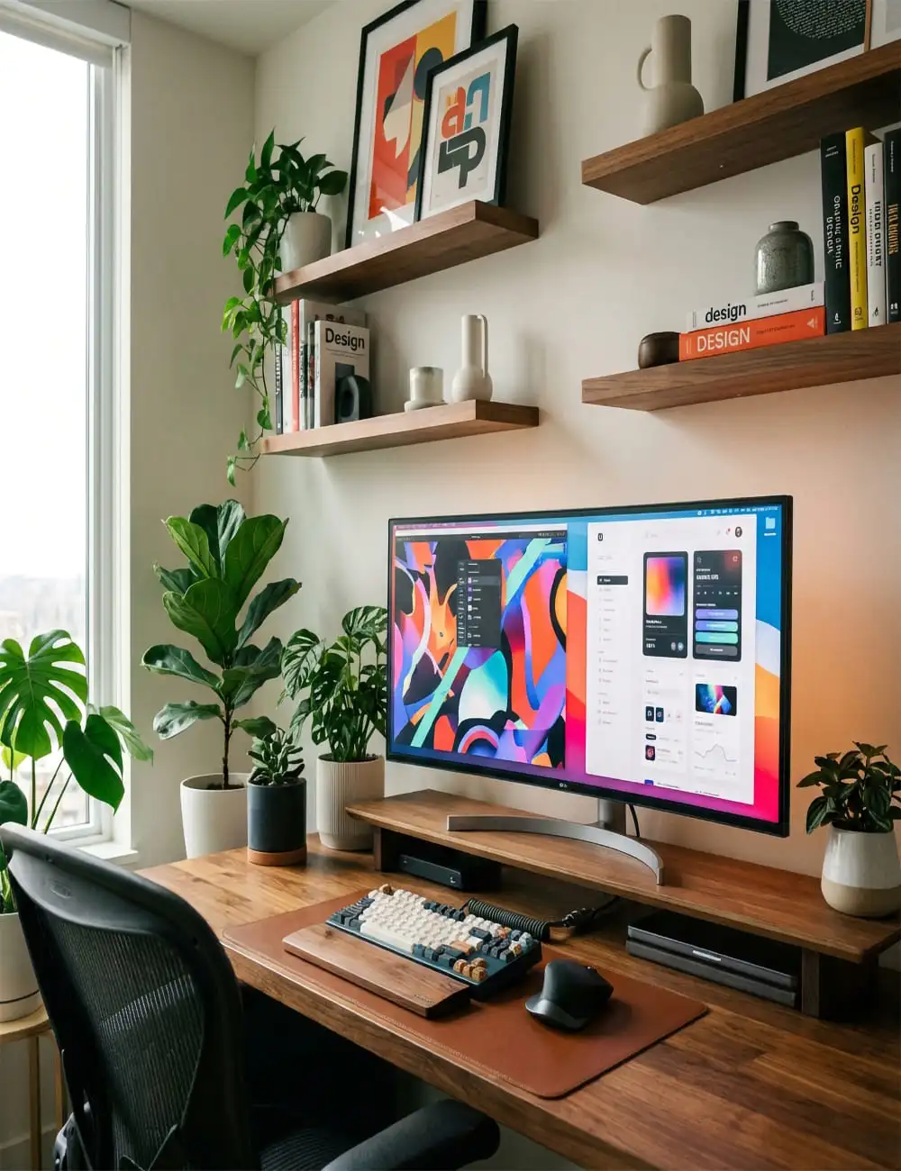
THE POWER OF TYPOGRAPHY IN WEB DESIGN
Learn how typography can make or break your website and discover tips for choosing the right fonts to create impact and readability.
"Typography is more than just selecting a font. It is the art of arranging type to make written language legible, readable, and appealing when displayed. In web design, typography is the backbone of communication, influencing how users perceive your brand and interact with your content."
01.The Foundation of Visual Hierarchy
Visual hierarchy is the arrangement or presentation of elements in a way that implies importance. In typography, this is achieved through variation in size, weight, and color. By making certain text elements larger or bolder, you guide the reader's eye to the most critical information first.
- Headings & Subheadings: Use distinct scales to separate sections and clarify the content structure.
- Weight for Emphasis: Bold weights draw attention immediately, while lighter weights are better for secondary details.
- Color Contrast: High contrast between text and background ensures that the hierarchy is visible to everyone.
- 💡Pro Tip: Always establish a consistent type scale (e.g., using a 1.250 major third ratio) to ensure mathematical harmony across your layout.
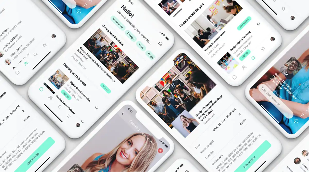
02.Font Psychology: Setting the Tone
Every font carries an emotional weight. The choice between a Serif and a Sans-Serif font can completely change the personality of a website. Serifs often convey tradition, authority, and elegance, while Sans-Serifs feel more modern, clean, and approachable.
- Serif Fonts: Ideal for long-form reading and brands that want to feel established (e.g., news sites, luxury labels).
- Sans-Serif Fonts: The standard for digital screens due to their clean lines and high legibility at small sizes.
- Display Fonts: Use these sparingly for hero sections to inject unique personality into your design.
- 💡Pro Tip: Don't just pick a font because it looks 'cool.' Pick it because it aligns with the brand's voice and the user's expectations.
03.Readability and The User Experience
A beautiful font is useless if it's hard to read. Readability is about how easily individual letters can be distinguished and how smoothly the eye can move across lines of text. This is influenced by line height (leading), letter spacing (tracking), and line length.
- Line Height: A rule of thumb is to set leading to 1.5x the font size for body text to allow the characters to 'breathe.'
- Letter Spacing: Tighten headings to feel more impactful, but loosen small caps or all-caps text to improve legibility.
- Optimal Line Length: Keep body text between 45 and 75 characters per line to prevent eye fatigue.
- 💡Pro Tip: Test your typography on multiple devices. What looks readable on a 27-inch monitor might be painful on a 6-inch phone screen.

04.The Art of Font Pairing
Pairing fonts is about finding a balance between contrast and harmony. You want two fonts that are different enough to be distinct but similar enough to feel like they belong to the same design system.
- Contrast is Key: Pair a Serif heading with a Sans-Serif body (or vice-versa) to create a clear visual distinction.
- Limit Your Palette: Stick to two font families (at most three) to avoid a cluttered and fragmented appearance.
- Match Your X-Heights: Fonts with similar x-heights tend to pair more harmoniously than those with drastic differences.
- 💡Pro Tip: Use font families that come with multiple weights and styles (superfamilies) to achieve variety without adding new typefaces.

05.Modern Trends in Digital Typography
As technology evolves, so does the way we use type. Modern web design is moving away from generic grids toward more expressive, brutalist, and interactive typography that treats text as a primary graphic element.
- Variable Fonts: A single file that allows for infinite variations in weight, width, and slant, offering unparalleled flexibility.
- Oversized Headings: Breaking the traditional rules by using massive type that dominates the screen for immediate impact.
- Kinetic Typography: Animating text to respond to scroll or hover, making the reading experience more immersive.
- 💡Pro Tip: While trends are inspiring, never sacrifice core legibility for a passing aesthetic fad.

More to Discover

How to Streamline Your Design Workflow
In today’s fast-paced creative industry, designers often find themselves juggling tight deadlines, complex client demands, and a mountain of creative tasks.

5 Design Trends That Will Define 2024
Explore the top design trends for 2024 that will influence web, UI/UX, and branding projects, helping you stay ahead of the curve.